
Beyond Red and Green: Christmas Color Palettes for Modern Interior

For decades, Christmas décor has been synonymous with one unmistakable duo: red and green. While this unquestioned pair has been repeated across centuries, reproduced through textiles, ornaments, and cultural memory, the palette of Christmas has begun to expand, dissolve, and reconstitute itself in ways that reflect broader shifts in how we aestheticize space. Today’s design-minded decorators are embracing bolder, softer, moodier, and more imaginative color stories that elevate holiday decorating into a true art form.
Rather than viewing these emerging palettes as mere stylistic deviations, we might understand them as evidence of a cultural shift in how the Christmas season is imagined and enacted. What was once a fixed red and green aesthetic vocabulary now expands into a field of possibilities, inviting us to reconsider how festive atmospheres are constructed, and what forms of meaning we hope to sustain within them.
The Quiet Interior: The Calm of Neutral Colors
Soft whites, greys, and natural woods evoke a winter stripped of spectacle – a quieter, more contemplative season. Here, the interior leans into stillness and subtly reject the pressure to perform visually, cultivating atmospheres of calm.


The rise of neutral Christmas palettes parallels the broader fascination with Scandinavian and Japanese minimalism. However, the appeal is not simply aesthetic. In an age of accelerated visual consumption, neutrality becomes a kind of refusal: a search for stillness, an attempt to reclaim presence in a season often dominated by excess. Here, Christmas becomes a pause rather than a performance, enhancing the architecture, materials, and natural light already present in your space.
Jewel Tones and the Desire for Depth
Conversely, the revival of jewel-toned Christmas décor – emerald, sapphire, plum, and gold – expresses a different form of longing. These colors, saturated and opulent, gesture toward a richness that neutral aesthetics suppress. Their visual weight responds to a cultural desire for depth in a digital era defined by flattening.

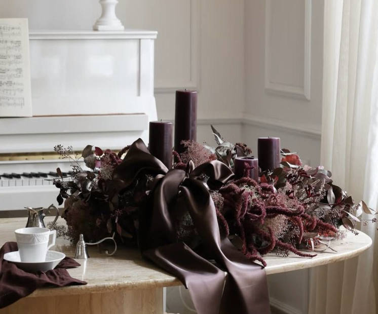
Jewel tones offer an interesting position: they are nostalgic yet contemporary, referencing historical interiors while thriving in modern, maximalist or Art-Deco-inspired spaces. In this sense, they are less about luxury and more about reintroducing density into our space.
Earth, Wood, and the Return to the Grounded Interior
Earth-based palettes – forest green, brown, charcoal, amber, clay – reflect a return to the elemental. They evoke the landscapes from which festive rituals once emerged, before consumer culture abstracted them into symbols. This aesthetic rejects the universality of commercial Christmas imagery, instead letting the season grow out of the land, weather, and materials that define it.

These interiors remind us that the rituals of winter and Christmas emerge not from ornamentation alone but from the physical conditions of the season: shorter days, colder air, the instinct to gather, the need for warmth. Color, here, acts as a bridge between interior space and the earth outside – an orientation toward place rather than performance.
Metallic Light and the Search for the Luminous
Champagne-toned metallics – soft gold, pearl, brushed silver – signal a shift toward subtle luminosity. Rather than the explosive glitter of commercial décor, these palettes offer a more diffused and gentle sense of radiance.


This palette mirrors contemporary preoccupations with light itself: its softness, its shifting nature, its ability to define space. In the winter months, light becomes a kind of material. The reflective surfaces of metallic décor amplify and distribute it, creating an interior glow that counters the darkness of outside. These choices reflect a longing for a gentler, more intentional kind of warmth than commercial décor offers.
Midnight Palettes and the Aesthetics of Quiet Drama
A growing number of designers now embrace blues, charcoals, and near-black tones for the season – a departure that reimagines Christmas through shadow rather than brightness. These palettes
evoke the nocturnal landscape: interiors that resemble the calm, dramatic qualities of night.

While unconventional, midnight palettes visualize a contemporary understanding of winter as a time not only for celebration but reflection. They challenge the assumption that festive environments must be visually loud to be emotionally resonant. Instead, they create atmospheres that invite pause, reflection, and a different form of gathering.
Color as Cultural Meaning
These evolving color choices extend beyond mere stylistic updates to seasonal décor and signal a shift in how festive identity is understood and expressed. As global aesthetics continue to circulate, individuals increasingly curate Christmas though the lens of personal resonance rather than inherited tradition.
Yet this raises questions: When Christmas becomes a palette rather than a historical ritual, what is preserved – and what is lost? Does the expansion of color liberate festive expression, or does it signal a further drift away from emotional connection?
Color, in this context, becomes a cultural gesture – an act of interpreting, reframing, and sometimes resisting the visual narratives handed down through tradition or dictated by the norm.
Toward a More Intentional Season
Perhaps the evolving palette of Christmas is not a rejection of its history but an expansion of its possibilities. In a world increasingly shaped by visual reproduction, the act of choosing color becomes an opportunity to reclaim meaning within the season – whether through silence, depth, earth, light, or shadow.


The contemporary Christmas interior, then, is not merely decorated. It is curated, negotiated, and reimagined.
It becomes a site of both personal and collective storytelling, where color is not only aesthetic but experiential: a way of positioning ourselves within a season that continues to expand and unfold through time.